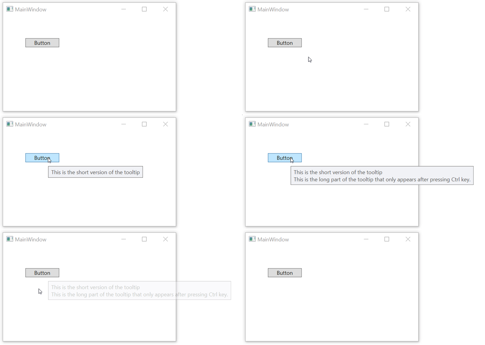
A colleague of mine came to me the other day with a challenging thing: the UX team is requesting to have some tool tips that, when pressing Ctrl key, should expand and show more details, more content.
This is tricky because of a number of reasons. First of all, tooltips don’t get focus so they can’t subscribe to any KeyDown events. Second, tooltips don’t inherit the DataContext from the parent control so the communication between the parent and the tooltip is a bit harder.
One solution could be to intercept PreviewKeyDown in the parent window and in case of Ctrl key down, then indicate to the active tooltip if any to extend itself. But this makes a hard logical dependency between the tooltip and the window it’s placed on. And also not working if the parent window doesn’t have focus (in this case, Windows still shows tooltips when controls are hovered but without focus, the window cannot detect any key presses).
An alternative, more elegant solution (but a tiny bit less performant) is to have the ToolTip itself poll for key presses every 20 ms or so and if Ctrl down detected, then expand itself.

This can be implemented with attached behaviors so it’s very easy to use: just add one attribute in xaml to the ToolTip control. No event handlers needed in the parent window and with some care, the polling is done only for those ToolTips that have this behavior activated and only when the ToolTip is visible. So the performance hit is quite negligible.
<Button Content="Button" HorizontalAlignment="Left" Margin="50,50,0,0" VerticalAlignment="Top" Width="75">
    <Button.ToolTip>
        <ToolTip local:ToolTipExtensions.IsExpandable="True">
            <StackPanel>
                <TextBlock Text="This is the short version of the tooltip" />
                <TextBlock Text="This is the long part of the tooltip that only appears after pressing Ctrl key."
                           Visibility="{Binding RelativeSource={RelativeSource AncestorType=ToolTip}, Path=(local:ToolTipExtensions.IsExpanded), Converter={StaticResource BooleanToVisibilityConverter}}" />
            </StackPanel>
        </ToolTip>
    </Button.ToolTip>
</Button>
First thing, the attached behavior is activated by setting local:ToolTipExtensions.IsExpandable=”True” on the ToolTip. This registers to the ToolTip’s IsVisibileChanged event, and when the ToolTip’s becomes visible, it starts polling every 50 ms to check if the Ctrl key has been pressed. This only happens while the ToolTip is visible, once IsVisible becomes false, polling stops.
Now we need a way to tell the ToolTip to show it’s extend side.
To do this, the actual state that the Ctrl has been pressed is stored to another attached property, IsExpanded, on the ToolTip, so that it can be accessed and bound to from the xaml. In the example, the second TextBlock becomes visible when the ToolTipExtensions.IsExpanded becomes true.
On Github one can see the entire example or jump directly the ToolTipExtensions class.